
Branded Environments
Graham Associates
How Uptimize Design rebranded Graham Associates for their 50th anniversary and modernized their Arlington office to attract new engineers.
- Client
- Graham Associates
- Industry
- Civil Engineering & Planning
- Location
- Arlington, TX
- Project Type
- 50th-anniversary rebrand and environmental design
The Challenge
Graham Associates is a civil engineering and planning firm in Arlington, Texas, established in 1972. Over five decades, they've engineered some of the region's biggest projects, including the Cowboys stadium, Viridian, and the Rangers' ballpark. By the firm's 50th anniversary, they had a problem the engineering work couldn't solve: the office was dark wood, red carpet, and red walls, and the brand still wore the same serif logo it had carried since 1972. Neither was reading to the younger engineers they needed to recruit.
The team was emotionally attached to the old identity. Fifty years is a long time to wear a logo. The brief was to modernize without losing what the firm valued about itself, build something younger talent would want to walk into, and produce a visual system as precise as the engineering it represents. The internal worry was that clients wouldn't recognize them after the change. That hurdle had to be navigated as carefully as the design itself.
Our Approach
We rebuilt the brand from the mark out. The new G monogram is constructed like a piece of civil engineering: three planes folded into an isometric solid, every angle measured, every line meeting a corner the way a beam meets a column. The color story moved to deep navy and layered blues, signaling precision and seriousness without becoming generic. A triangle pattern derived from the mark became the visual hook that ran across every brand application.
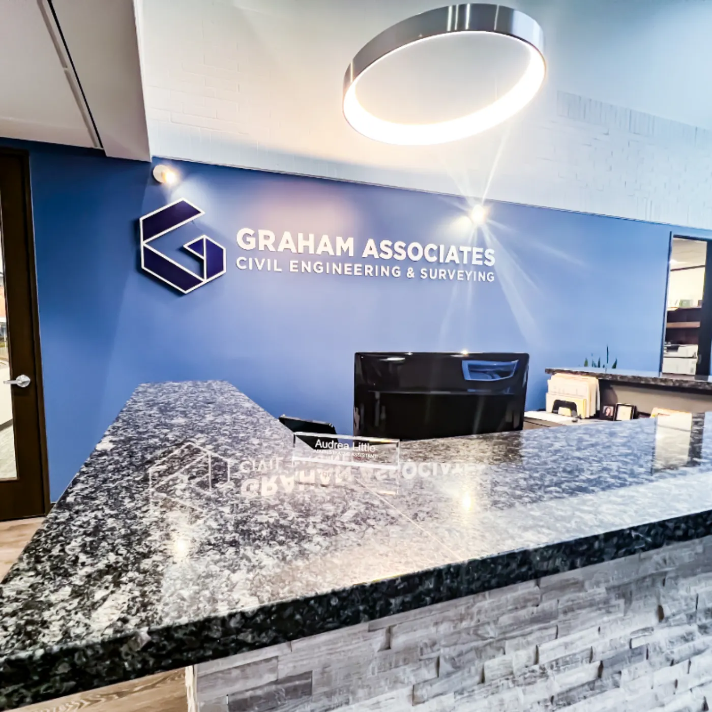
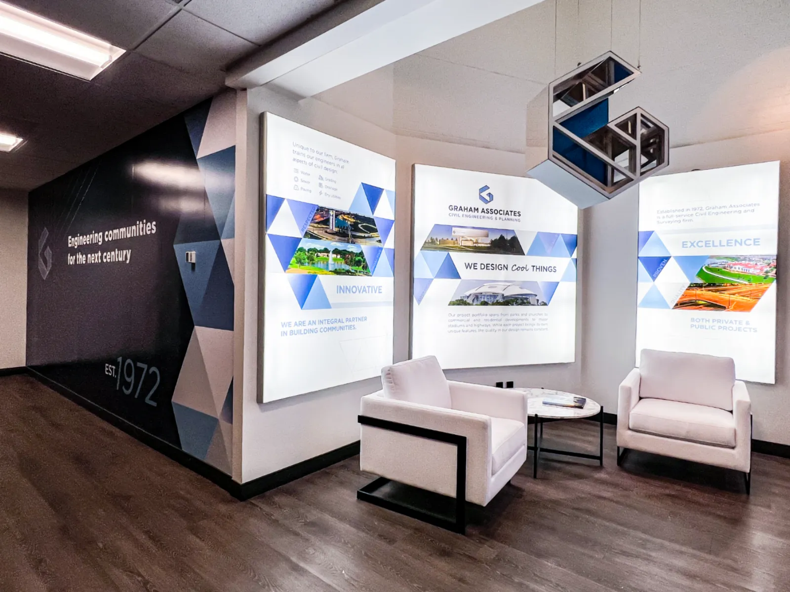
In the office, we replaced dark wood and red walls with bright surfaces, custom vinyl wall graphics, dimensional acrylic signage, and backlit brand panels. The mission wall, the vision wall, the engineering-communities feature wall, and the reception desk all carry pieces of the same system. After the team got past the worry about the change, they couldn't stop talking about how excited they were to show the new office to clients, prospects, and new hires.
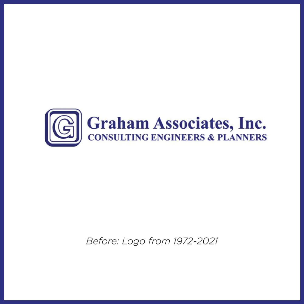
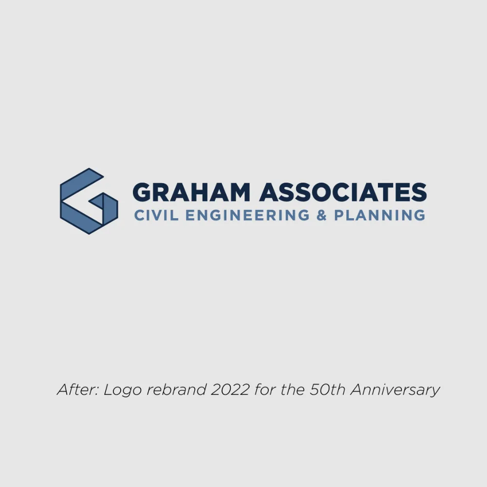

From 1972 to 2022: a 50-year-old wordmark refined into an isometric mark built like the engineering work it represents.
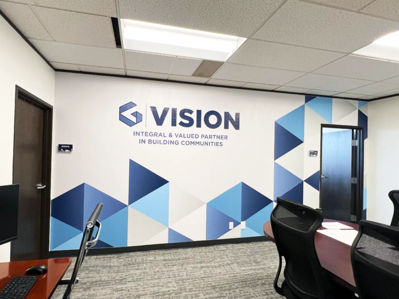
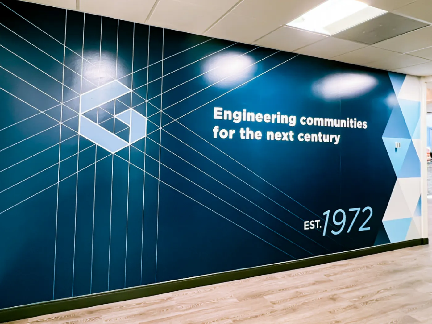
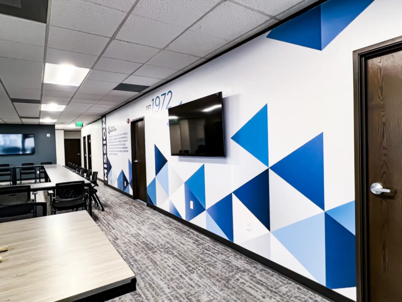
Mission, Vision, and the 50th-anniversary tagline carried across the office in large-format vinyl installs.
Not sure where to start?
Tell us about your project and we’ll point you in the right direction. No pressure, no commitment.